In our Cyberarts class, our next big project will be to create a music video to a song of our choice. but before we can do that, we needed to do some research. Our teacher provided a couple links for us to choose from, which were comprised of 30 all time music videos over the decades. We were to watch 9 of them and write our summaries about them. here's the link to the site I chose to watch from.
From the 9 videos, I watched, "once in a lifetime" by talking Heads (1980), honestly gave me chills down my spine and tripped me out. With the singers constant head jerks and odd body motions, it made me continuously think that they were on something while making this. The second video I watched was "Cry" by Godley and Creme (1985), the main pull I had to this video was loving the transitions from face to face, all mouthing the words to the song. the video was beautifully executed. The third video was "Buddy Holly" by Weezeer (1994). This video, I consider, to be the first video amazing in concept, wonderfully executed. A number of effects put in post-film from the tracking of the characters from the original show, Happy Days, the grain of the video and color match were excellent. the fourth video was " Coffee and TV" by Blur (1999). The main draw I got from this video, was the little milk carton and his big adventure to 'find' the lead singer. I also consider this video to be an art piece because it catches your eye and pulls the viewer to continue to watch the video.the fifth video was " All is Full of Love" by Bjork (1999). The main reason I watched this video was the whole concept was a robot who was built and who finds love through the video. the sixth video was D'Angelo 'Untitled(how does it feel) (2000).This is a video that received a ton of controversies, and mimic videos (P!ATD Girls Girls Boys). I would consider this to be an artistic video because it got the attention it needed and deserved. It also has a lasting effect on people. The seventh video was "Here It Goes Again" by OK GO(2006). Although this video was filled all through webcam, it is extremely strong and it set the type of videos they made from then on. 'One Takes' as they're called on YouTube, this type of video brought a ton of attention towards the band and a very young YouTube. Although the concept is extremely simple, and the video is just them singing while contorting around treadmills, it was intensely choreographed between the four band members. The eighth video I watched was Kanye West's 'Runaway'(2010). This video helped change the 'proper' length of set music videos (about 3-5 mins) Kanye had made a full short film (35 mins) uploaded to YouTube. Throughout the story, Kanye is trying to get a female Pheonix to adapt to human life and our way of living. this concept is a fairly odd thing to come up with, but it's Kanye. A very intense story and excellently executed by Kanye and crew. I would consider this video to be very artistic, with no single, or easy, way to explain it unless you've watched it yourself. The final video I had watched was 'Single Ladies' by Beyonce (2008). Of course saved the queen for last, and just wow. The choreography for the three featured on screen. With a simple set, costume, hair, and makeup, it really makes everything else to the point and surprisingly aggressive. Like the saying 'less, is more.' And that's what this video is.
We were told to compare 'We Used to Wait' by Arcade Fire to earlier decades, I think that it's a very, very strong video, and I think it brings back the feeling of something new and innovative to the table, instead of copying and pasting the same new video algorithm.
Friday, 11 November 2016

Thursday, 10 November 2016
Open Shade / Direct Sunlight / Window Light
Below are three photos I took for a school project. Open Shade / Direct Sunlight / Window Light


Thursday, 13 October 2016
The Renaissance Presentation
https://drive.google.com/open?id=15e1T20Wy0BGaJP2DPgVkaFgGOCPlW0YP6muMe8xE_BE
The link for my presentation is posted above.
The link for my presentation is posted above.
Saturday, 8 October 2016
Steve Carty Photography Workshop
The other day Steve Carty, a famous photographer, came into our CyberArts program and did a photography workshop with us. We were after asked by our teacher to choose three pictures from that day to upload to our blog. So featured below are my three pictures from the workshop.
 So the first photo above is taken in a studio with a single light fixture off to the right side of his face. with no reflector, we shot inside at Iso 400 at 120 shutter speed, the f-stop was at 16. the lens was put into a length of 50mm. The subject was placed an arm's length away from the background. the background is not lit by any other light beside the one single light. The subject was in a very comfortable state and that relates to his expression. The placement of the frame, being vertical, works much better than if it was horizontal.
 In this photo, I had placed the subject against a brick wall outside. The day was fairly overcast, so the subject is fairly evenly lit. No use of a reflector for this picture. The subject, again, is in a very relaxed state. The camera was set down to Iso 200 f-stop was set to its lowest, 4.5, the lens was still zoomed to 50mm. The placement of the subject works, once again, being vertical rather than horizontal.


This is a diagram of the studio set up that we used.


For this photo, we went back into the studio, this time, the subject was placed a bit more centered towards the light back to an iso 400 and shutter speed 120, f-stop 16. This time, a gold reflector was used to bump up the side of his face. The subject once again was very comfortable in his position, reflected on his facial expression. The single light I used, was focused a bit more downward onto him. the framing of this picture works vertically because it has a stronger composition than if it was horizontal.

This is a diagram of the studio set up that we used.
Wednesday, 14 September 2016
Four Influences of Exposure
For our first assignment, we were asked to find four images, two based off shutter speed and two off of depth of field (DoF), and explain how we know that's what they are.


This picture uses the opposite Influences than the one above because it uses a slow shutter speed and wide DoF. I know this because, the shot is very wide and all in focus. I know that this photo uses a slow shutter speed, because the water looks very soft as it moves over the sturdy rocks.
What I Want to Take Photos of.
For our second assignment we were asked to choose three pictures of what kind of photography we wanted to shoot. I had said pictures of cosplayer's in costumes that tell a story. Below show the type of photo's I was talking about. All three photos include a total different lighting for each one. The first includes harsh sun light with a shallow depth of field, the middle is light provided from a flash with a long depth of field, and the last uses window light with a wide depth of field.


Friday, 17 June 2016
Friday, 20 May 2016
Poster and T-shirt: Tattered Seams


My Creative prosess, of my poster, started with an initial idea of a lone circus tent, later changing it to the jack in the box pasted above. My t-shirt design was started and finished with the same design, a sign that semi resembles a tiger head. For the t-shirt, we were given the task of creating a shirt using only two colours, I originally had three colours, cutting it down, to what is pasted above, later. I chose to do a more sign design because, I wanted to do more of a traditional family circus shirt. For the poster, I wanted to go for more of an upbeat exterior but if you were to look at it for too long it could possibly give you a feeling of discomfort, I'm happy on how it came out, I think I executed it pretty well. I decided to use Adobe Illustrator for both because I find it an easier program to use for posters and logos e.t.c unlike Adobe Photoshop. For my shirt, I traced the outline of a circus ticket sign, but the interior was my own design, the inside shape is just a shrunken verson of the outline filled and coloured orange. For my poster, like I said, was originally a lone circus tent, but with some peir critisisum, I changed it to the jack in the box here. I used the pen tool for all of the shapes, and used my favourite kind of logo and poster design, flat design to create my poster. I had to keep moving points around because, he took a while to create and finnish. I am very satisfied by my final products on both my shirt and poster. I think they potray the play pretty well, but that is pretty bias as I spent so much time looking at it.
Tuesday, 10 May 2016
Kinetic Typography
I liked this kinetic typography of Rap God by Eminem. I think that the speed and timing of this specific kinetic typography was paced very well, as this song is a very fast paced song, I think the animator did an amazing job at getting the words out on each of the syllables. The movement of the text go from being a constant shaking to being formed into different pictures, but they have a large energy feel, and the constant movement helps this. A good amount of the emphasized words were chosen to be made the pictures of the object, an example is when Eminem says the line:
"Me, I'm a product of Rakim Lakim Shabazz, 2Pac, N-W-A., Cube, hey, Doc, Ren Yella, Eazy, thank you, they got Slim"
This was emphasized by putting all these rappers faces instead of their individual names. This kinetic typography is unified by mainly using three colours, Red, White, and Black. the font choice was good for this type of song, because it's a very powerful font as it is bold, and caps throughout. the overall design is all over, exactly like this song, so it works.
Sunday, 10 April 2016

Tuesday, 9 February 2016


Wednesday, 21 January 2015

Monday, 19 January 2015
In My Head - Culminating Project
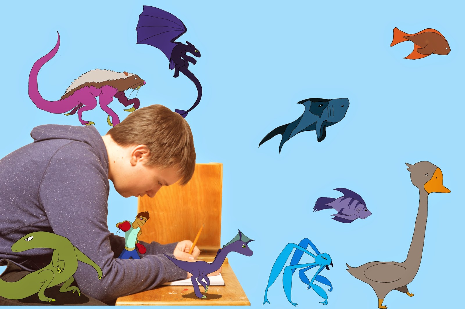 This piece is called "In My Head" which I did for my culminating project. The point of our culminating project was to choose something that mattered to us. I chose one of the biggest parts of my life, drawing. I chose drawing because I have drawn for the majority of my life. I wanted to show what it is like to be in my head whilst I draw. So I took a picture of my closest friend to portray myself and placed some of my quick drawings around him.
My intended message was that while I draw, many images go through my mind. I wanted to show some of the drawings that can, and will, come out of my mind and onto the page.
The photo I used is a picture of my friend looking focused towards the page of a sketchbook and drawing. I surrounded him with some of the artwork I drew for this assignment. I decided to put my drawings in these places because I needed to, somehow, show my drawings come to "life" and surrounding me.
My procedure was to start with my idea. I was lucky, since I had come up with it earlier. I started by sketching an idea in my sketchbook. It was a sketch of a person drawing with their sketches coming out of their head. After I came up with the idea, it was picture time. I chose to set up my picture inside of our classroom where we take portraits. My friend sat down and I asked him to look like he was drawing in my sketchbook. I took one vertical and one horizontal shot and felt that I had what I needed. Then I imported the photos that I took and chose the best one. I then brought my selected picture into Photoshop. The next step I did was I quick selected the photo of my friend and made a new layer and pasted it. Under that layer, I made a new layer and coloured it blue.
Next, I had to draw the original drawings outside of the computer. Once they were done, I scanned them into the computer. I then dragged the scanned drawings and placed them one by one into Photoshop. The next step was to trace the original images and colour them in. To do this I had to create a new file in Photoshop for each image and then add a layer for tracing and then a layer to colour it in. This took a few days as I was tracing multiple images. In the end I had 10 files to add to my original picture.
The last step to my process was to add the drawings to the photo. To do this I selected around each drawing and pasted it into the original picture file. I then moved them and sized them until I liked how it looked. For example, at first I placed the boxer behind my friends back but then I didn't like how it looked so I placed him between his arms so it looked like he was standing on the table. I then made a layer under the dinosaur and the lizard and lowered the opacity to 56% and drew smaller circles than the actual body and coloured them in black in order to create a shadow.
In the end, my surrealism picture has a total of 15 layers.
During this assignment I have learned a bit about myself. One thing I have learned is that the thoughts that I have while I draw and generally think are many. In the making of this project I took a lot of time to myself and just thought about more things. In my opinion I have connected more with myself and grown some self awareness of myself.
I am very happy with how my culminating project turned out. The topic I chose is, I believe, one, if not the only, more upbeat topics that has been chosen by the year one CyberARTS class for our culminating assignments. Although it was a long process I feel the outcome reflects what I was aiming for.
This is, I think, my last post for at least awhile. So, when I get back on, I'll post some improved artwork for all you peoples to see.
- GT
ARTS
My procedure was to start with my idea. I was lucky, since I had come up with it earlier. I started by sketching an idea in my sketchbook. It was a sketch of a person drawing with their sketches coming out of their head. After I came up with the idea, it was picture time. I chose to set up my picture inside of our classroom where we take portraits. My friend sat down and I asked him to look like he was drawing in my sketchbook. I took one vertical and one horizontal shot and felt that I had what I needed. Then I imported the photos that I took and chose the best one. I then brought my selected picture into Photoshop. The next step I did was I quick selected the photo of my friend and made a new layer and pasted it. Under that layer, I made a new layer and coloured it blue.
Next, I had to draw the original drawings outside of the computer. Once they were done, I scanned them into the computer. I then dragged the scanned drawings and placed them one by one into Photoshop. The next step was to trace the original images and colour them in. To do this I had to create a new file in Photoshop for each image and then add a layer for tracing and then a layer to colour it in. This took a few days as I was tracing multiple images. In the end I had 10 files to add to my original picture.
The last step to my process was to add the drawings to the photo. To do this I selected around each drawing and pasted it into the original picture file. I then moved them and sized them until I liked how it looked. For example, at first I placed the boxer behind my friends back but then I didn't like how it looked so I placed him between his arms so it looked like he was standing on the table. I then made a layer under the dinosaur and the lizard and lowered the opacity to 56% and drew smaller circles than the actual body and coloured them in black in order to create a shadow.
In the end, my surrealism picture has a total of 15 layers.
During this assignment I have learned a bit about myself. One thing I have learned is that the thoughts that I have while I draw and generally think are many. In the making of this project I took a lot of time to myself and just thought about more things. In my opinion I have connected more with myself and grown some self awareness of myself.
I am very happy with how my culminating project turned out. The topic I chose is, I believe, one, if not the only, more upbeat topics that has been chosen by the year one CyberARTS class for our culminating assignments. Although it was a long process I feel the outcome reflects what I was aiming for.
This is, I think, my last post for at least awhile. So, when I get back on, I'll post some improved artwork for all you peoples to see.
- GT
ARTS
Wednesday, 14 January 2015
Surrealism Project ~ Salvador Dali
Link to the presentation: https://prezi.com/vsvhptjecuv3/surrealism-project/
Tuesday, 13 January 2015
369 ~ Video Assingment
A) The strengths of our video are the song and the transitions. The weakness of our video is the credits. I think we could have slowed it down a small bit.
B)The soundtrack impacted the emotional experience of our video by making it more upbeat and exciting to watch.
C) The editing decisions that worked with the soundtrack are the instant transitions from clip to clip when a harder bass goes.
D)The pace and choice of transitions assisted in creating a mood by making the video feel exiting.
E) My experience working in a group was fun. But I give all credit for editing and song choice to my partners.
(Video: http://noodledoodledooo.blogspot.ca/ )
B)The soundtrack impacted the emotional experience of our video by making it more upbeat and exciting to watch.
C) The editing decisions that worked with the soundtrack are the instant transitions from clip to clip when a harder bass goes.
D)The pace and choice of transitions assisted in creating a mood by making the video feel exiting.
E) My experience working in a group was fun. But I give all credit for editing and song choice to my partners.
(Video: http://noodledoodledooo.blogspot.ca/ )
Tuesday, 6 January 2015
Black and White Plus One~ Assignment
A few weeks ago in year one CyberARTS,we had an assignment to take one of our garden photos, and make it black and white then chose one colour. Some of us were lucky enough to be chosen to take part in an awesome art show held by the year fours and Lakeshore Arts called "Black and White Plus One".
I was one of the lucky people to be chosen to take part in this art show.

For this picture, I had to first put a black and white layer over my picture. Then I had to put a gradient map. I took the eraser tool to erase the black and white layer to show the colour. I copied the erasing, and pasted it on the bottom layer, which is the black and white layer. I added a levels layer to darken the background, so the flowers colour would stand out more.
Monday, 5 January 2015
T-Shirt Design- LCI Competition

The process was long but the outcome looks awesome!
We were given a few rules, the first rule was to understand our goal. The goal was to create a cool looking shirt. The second rule was to know all the technological programs we have at our school. Then we had to search for some ideas over Pinterest, so we could have some ideas for our designs. After tossing some ideas around and drawing some thumbnails to chose from I decided to go with this one(as seen above).
We had to submit 3 different visuals, the original(the largest), Seven colours, and our design on a t-shirt. We did this to have a visual of what it would look like if it got produced.
On the bottom right, is my original. To make it, I had to draw all the individual icons in my sketchbook then I had to scan it in. I imported it into Adobe Illustrator, then started going around the edges with the pen tool. I took an image representaiton of a motherboard into Adobe Photoshop and cut it into the shapes I needed for the wings of the Phoenix then put those images into Adobe Illustrator.
For the colours, I copied my design and pasted it seven times. Then changed the colour on each of them so we could see the design in a variety of colours.
I put my design on to two different coloured shirts to have the look of my design on different colours.
I think if I were to change it I wouldve changed the colour of it entirely. With the change of colour it could've had a different feel to it.
Overall, I enjoyed going through the process of making a tshirt design.
Tuesday, 9 December 2014
Black and White ~ Assignment.
A few weeks ago in CyberARTS we had to take one of the garden photos we took and turn it into Black and White three times. We did this so that we could practice different ways to use Adobe Photoshop CS6. We were given this task because we are taking part in an art show coming up called
"Black and White +1"

For this one, I chose the red channel, from the RGB Channels. Then I turned it to a grey scale. I added a gradient scale to darken the darker areas. After, I added a levels layer to further darken and lighten the areas that needed a "boost"

For my second one, I chose the red channel from the RGB channels. Then I put a grey scale over the picture. After, I made a g radiant map to darken up the layer.

For my third and final picture, I chose the red channel from the RGB channels. I turned it into a grey scale then I added a curves layer to lighten up the picture itself.
Wednesday, 12 November 2014
Realistic Chess Piece Assignment

-In CyberARTS the other day, we were given the assignment to draw a realistic chess piece that had a background which were to have movement and repetition. we had to give the chess piece depth, by drawing a gradient scale to be able to get the darkest and lightest we could.
- The background I chose was a warped chess/checker board. The way my background shows movement is the squares that I put in a rotation like pattern. It gets your eyes to look around in circles, from left to right or right to left, following the way the squares are going. The other way my piece of art shows movement is the up and down from the spirals up and down as well.
-The way my piece of art shows repetition is by the squares from the chess board. it is a repeated pattern of dark, than light, than dark, then light etc. I chose this pattern because it looks like the board has somehow been molded around the chess piece. It repeats downward as well as sideways making your eyes move around the page.
Tuesday, 4 November 2014
Garden Assignment - Photography
- A couple weeks ago in CyberARTS, we were given the assignment to go and take pictures of the L.C.I Garden then slightly edit them to make them pop out more. We only learned about composition after we took the pictures, so these are mostly how they turned out.


- I like this photo because the flower bud is off centre, but in the centre at the same time. The light yellow colour makes the flower bud pop out from the, dark green, background and makes the picture have a variety of colour.
-I like this photo because the radish is just off centre but doesn't look it. It looks to be, just in the middle. I like the colour of the dirt letting the radish pop out. the main colours that stand out are a bright red, a dirty-yellow, a light green and a grey-brown

-I like this picture a lot because the flower is pretty mush in the centre, but the main subject which is the bee is just off centre, letting the effect of the flower being just off centre. I love the colours in it. Just the bright pink letting it stand out a lot more.

- This photo stands out to me because, I like how the corn stalks line up. I took this photo from the "worms eye view" perspective to just how tall the corn stalks could be, so the corn stalks will line up a lot better than from just a straight on viewing point. The corn stalks stand out from the background for how bright the sky is.


- This photo appeals to me because the flower is pointed diagonally, it puts the flower off centre but still in the centre. it's also surrounded by old a new flowers witch, makes a border for this single flower. The promanent colours her are yellow and orange, witch stand out the most, make this photo pop.

Subscribe to:
Posts (Atom)