
Wednesday, 21 January 2015
Monday, 19 January 2015
In My Head - Culminating Project
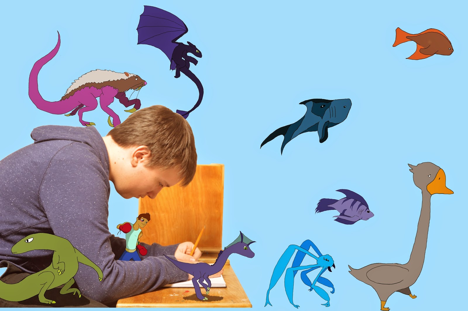 This piece is called "In My Head" which I did for my culminating project. The point of our culminating project was to choose something that mattered to us. I chose one of the biggest parts of my life, drawing. I chose drawing because I have drawn for the majority of my life. I wanted to show what it is like to be in my head whilst I draw. So I took a picture of my closest friend to portray myself and placed some of my quick drawings around him.
My intended message was that while I draw, many images go through my mind. I wanted to show some of the drawings that can, and will, come out of my mind and onto the page.
The photo I used is a picture of my friend looking focused towards the page of a sketchbook and drawing. I surrounded him with some of the artwork I drew for this assignment. I decided to put my drawings in these places because I needed to, somehow, show my drawings come to "life" and surrounding me.
My procedure was to start with my idea. I was lucky, since I had come up with it earlier. I started by sketching an idea in my sketchbook. It was a sketch of a person drawing with their sketches coming out of their head. After I came up with the idea, it was picture time. I chose to set up my picture inside of our classroom where we take portraits. My friend sat down and I asked him to look like he was drawing in my sketchbook. I took one vertical and one horizontal shot and felt that I had what I needed. Then I imported the photos that I took and chose the best one. I then brought my selected picture into Photoshop. The next step I did was I quick selected the photo of my friend and made a new layer and pasted it. Under that layer, I made a new layer and coloured it blue.
Next, I had to draw the original drawings outside of the computer. Once they were done, I scanned them into the computer. I then dragged the scanned drawings and placed them one by one into Photoshop. The next step was to trace the original images and colour them in. To do this I had to create a new file in Photoshop for each image and then add a layer for tracing and then a layer to colour it in. This took a few days as I was tracing multiple images. In the end I had 10 files to add to my original picture.
The last step to my process was to add the drawings to the photo. To do this I selected around each drawing and pasted it into the original picture file. I then moved them and sized them until I liked how it looked. For example, at first I placed the boxer behind my friends back but then I didn't like how it looked so I placed him between his arms so it looked like he was standing on the table. I then made a layer under the dinosaur and the lizard and lowered the opacity to 56% and drew smaller circles than the actual body and coloured them in black in order to create a shadow.
In the end, my surrealism picture has a total of 15 layers.
During this assignment I have learned a bit about myself. One thing I have learned is that the thoughts that I have while I draw and generally think are many. In the making of this project I took a lot of time to myself and just thought about more things. In my opinion I have connected more with myself and grown some self awareness of myself.
I am very happy with how my culminating project turned out. The topic I chose is, I believe, one, if not the only, more upbeat topics that has been chosen by the year one CyberARTS class for our culminating assignments. Although it was a long process I feel the outcome reflects what I was aiming for.
This is, I think, my last post for at least awhile. So, when I get back on, I'll post some improved artwork for all you peoples to see.
- GT
ARTS
Wednesday, 14 January 2015
Surrealism Project ~ Salvador Dali
Link to the presentation: https://prezi.com/vsvhptjecuv3/surrealism-project/
Tuesday, 13 January 2015
369 ~ Video Assingment
A) The strengths of our video are the song and the transitions. The weakness of our video is the credits. I think we could have slowed it down a small bit.
B)The soundtrack impacted the emotional experience of our video by making it more upbeat and exciting to watch.
C) The editing decisions that worked with the soundtrack are the instant transitions from clip to clip when a harder bass goes.
D)The pace and choice of transitions assisted in creating a mood by making the video feel exiting.
E) My experience working in a group was fun. But I give all credit for editing and song choice to my partners.
(Video: http://noodledoodledooo.blogspot.ca/ )
Tuesday, 6 January 2015
Black and White Plus One~ Assignment
A few weeks ago in year one CyberARTS,we had an assignment to take one of our garden photos, and make it black and white then chose one colour. Some of us were lucky enough to be chosen to take part in an awesome art show held by the year fours and Lakeshore Arts called "Black and White Plus One".
I was one of the lucky people to be chosen to take part in this art show.

For this picture, I had to first put a black and white layer over my picture. Then I had to put a gradient map. I took the eraser tool to erase the black and white layer to show the colour. I copied the erasing, and pasted it on the bottom layer, which is the black and white layer. I added a levels layer to darken the background, so the flowers colour would stand out more.
Monday, 5 January 2015
T-Shirt Design- LCI Competition
The process was long but the outcome looks awesome!
We were given a few rules, the first rule was to understand our goal. The goal was to create a cool looking shirt. The second rule was to know all the technological programs we have at our school. Then we had to search for some ideas over Pinterest, so we could have some ideas for our designs. After tossing some ideas around and drawing some thumbnails to chose from I decided to go with this one(as seen above).
We had to submit 3 different visuals, the original(the largest), Seven colours, and our design on a t-shirt. We did this to have a visual of what it would look like if it got produced.
On the bottom right, is my original. To make it, I had to draw all the individual icons in my sketchbook then I had to scan it in. I imported it into Adobe Illustrator, then started going around the edges with the pen tool. I took an image representaiton of a motherboard into Adobe Photoshop and cut it into the shapes I needed for the wings of the Phoenix then put those images into Adobe Illustrator.
For the colours, I copied my design and pasted it seven times. Then changed the colour on each of them so we could see the design in a variety of colours.
I put my design on to two different coloured shirts to have the look of my design on different colours.
I think if I were to change it I wouldve changed the colour of it entirely. With the change of colour it could've had a different feel to it.
Overall, I enjoyed going through the process of making a tshirt design.
Subscribe to:
Posts (Atom)