Navigate

Tuesday 9 December 2014

Black and White ~ Assignment.


A few weeks ago in CyberARTS we had to take one of the garden photos we took and turn it into Black and White three times. We did this so that we could practice different ways to use Adobe Photoshop CS6. We were given this task because we are taking part in an art show coming up called 
"Black and White +1"

For this one, I chose the red channel, from the RGB Channels. Then I turned it to a grey scale. I added a gradient scale to darken the darker areas. After, I added a levels layer to further darken and lighten the areas that needed a "boost"


For my second one, I chose the red channel from the RGB channels. Then I put a grey scale over the picture. After, I made a g radiant map to darken up the layer.


For my third and final picture, I chose the red channel from the RGB channels. I turned it into a grey scale then I added a curves layer to lighten up the picture itself.


Wednesday 12 November 2014

Realistic Chess Piece Assignment


-In CyberARTS the other day, we were given the assignment to draw a realistic chess piece that had a background which were to have movement and repetition. we had to give the chess piece depth, by drawing a gradient scale to be able to get the darkest and lightest we could.

- The background I chose was a warped chess/checker board. The way my background shows movement is the squares that I put in a rotation like pattern. It gets your eyes to look around in circles, from left to right or right to left, following the way the squares are going. The other way my piece of art shows movement is the up and down from the spirals up and down as well.

 -The way my piece of art shows repetition is by the squares from the chess board. it is a repeated pattern of dark, than light, than dark, then light etc. I chose this pattern because it looks like the board has somehow been molded around the chess piece. It repeats downward as well as sideways making your eyes move around the page.


Tuesday 4 November 2014

Garden Assignment - Photography


- A couple weeks ago in CyberARTS, we were given the assignment to go and take pictures of the L.C.I Garden then slightly edit them to make them pop out more. We only learned about composition after we took the pictures, so these are mostly how they turned out.


- I like this photo because the flower bud is off centre, but in the centre at the same time. The light yellow colour makes the flower bud pop out from the, dark green, background and makes the picture have a variety of colour.


-I like this photo because the radish is just off centre but doesn't look it. It looks to be, just in the middle. I like the colour of the dirt letting the radish pop out. the main colours that stand out are a bright red, a dirty-yellow, a light green and a grey-brown


-I like this picture a lot because the flower is pretty mush in the centre, but the main subject which is the bee is just off centre, letting the effect of the flower being just off centre. I love the colours in it. Just the bright pink letting it stand out a lot more.


- This photo stands out to me because, I like how the corn stalks line up. I took this photo from the "worms eye view" perspective to just how tall the corn stalks could be, so the corn stalks will line up a lot better than from just a straight on viewing point. The corn stalks stand out from the background for how bright the sky is.


- This photo appeals to me because the flower is pointed diagonally, it puts the flower off centre but still in the centre. it's also surrounded by old a new flowers witch, makes a border for this single flower. The promanent colours her are yellow and orange, witch stand out the most, make this photo pop.


Wednesday 22 October 2014

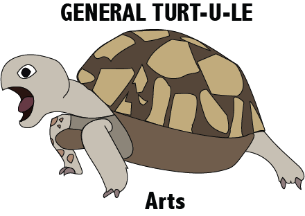
Illustrator tracing assignment - Logo


I choose a turtle because its my favourite animal. I like turtles because they have a hard outside but a soft inside just like me. I used a lot of circular and sharp edged shapes. The only typography that I added is my blog name.

 I chose to make the texture of the turtle smooth because if I made all the scales, it would look too cluttered.  I made the quality of the line finer then darker because it shows were the shape is completely. The letterform says 'GENERAL TURT-U-LE Arts' because its the name of my blog and what I call myself on social media.

 The name of the font I used is . All the lines are the same size, its a thin medium size. The shapes inside the turtle's shell, to me, they represent the shapes of provinces, territories, states etc. From this assignment I learned how to use the basic pen tool,  the text tool, the erase tool properly and how to do all that with only a mouse.

I'm quite happy with how my logo turned out because to me it looks like I thought it would. If I were given a bit more time to complete this assignment, i would have changed the way the shell is shaped, the front leg (it was supposed to have scales but they wouldn't show up) and the legs. During this assignment I learned to look at every little bit inside your logo, for designing a logo. Next I would like to design more things in Illustrator.


Thursday 16 October 2014

The Third-Class Carriage

The Third-Class Carriage
By: The year one CyberARTS 2014-2015

Today in CyberARTS we recreated Daumier's Third-Class Carriage using the medium charcoal. Our challenge was to take one of the thirty small pictures of the third-class carriage. To complete this assignment, we used two types of charcoal. The first type was willow, the lighter shades, and the second was compressed charcoal, the darker shades.

I think that this recreation of Daumier's Third-Class Carriage presents imitationalism because of its concern for accuracy to the original small pictures we were given. In my opinion it turned out very close to the original. The darkest dark's matched up very well. In the top left corner, the mans hat, matches up very well with each other. Just to the left of the middle is a lady caring for her child I think that is anouther point that matches up very well.

I think our recreation of The Third-Class Carriage was successful in showing formalism by, all the lines, textures and shapes. It shows unity between these three elements by all the lines and shapes producing a skin like look.

Our recreation of Daumier's Third-Class Carriage shows emotionalism by the mood, expressive feelings and how subjective it is. It sets the mood by how dark the dark's are, the expressions on the peoples faces are and how the subjects are postured. In our recreation, the darkest dark's are the darkest we could possibly go. In my opinion, we matched up the faces quite well to the original. The posture of the subjects are a large key to this particular mood because in the 18th century third class was the lowest class you could get. You would sit in the last few train cars where all the sut would end up.

Thursday 25 September 2014

Thummbprint Identity


Work Title: Random

I chose to make the main spot green because it's my favourite colour. In my opinion, the streaks of different colours make the green spot pop out more.some of the sentences I chose to write are I'll never fly like a bird, I love Dollarama, and I've been to England, twice. I named my piece random because it looks like my personality random streaks going here and there, barely able to understand what it means.

Friday 5 September 2014

Typographic Identity


The  reason I chose to do my words in the shape of a turtle is because, turtles, they're my favorite animal. The theme I colours I chose are very green and it makes me feel calmer when I look at them.

Some of the words I chose to put in this were rabbits, dogs, MTG and England.

I chose the word rabbits because a few months ago my father went up with his two brothers to see their mom while she was in hospital. When they got back to my grandparents house they started to do some yard work. My one uncle chased off a mother rabbit out of its hole and saw these tiny animals, he thought they were baby mice. Attempting to drown them, he put them in a bucket. My other uncle wouldn't let him take a shovel to the poor things. In the pictures that I have seen, there were around 8-9 babies originally. Having the knowledge to do CPR (minus mouth to mouth) my father was able to save three of them to bring home with him.

I choose the word dogs because my family and I owned a dog before and his name was Buddy. He sadly had to be put down because of some sort of cancer. a few years later we got our second puppy. at the time she was only three months old, and had no name. We ended up naming her Melody.

I chose the word MTG because I love playing the strategy trading card game called Magic The Gathering (MTG). My cousin, had been playing it while I was visiting one time. From then on I was hooked. Now I believe my collection of the card is larger than his.

I chose the word England, because for two summers in a row my family and I were fortunate enough to fly over to England. For the first year we only stayed for nine days. The second year we stayed for about two weeks.