Navigate

Wednesday 22 October 2014

Illustrator tracing assignment - Logo


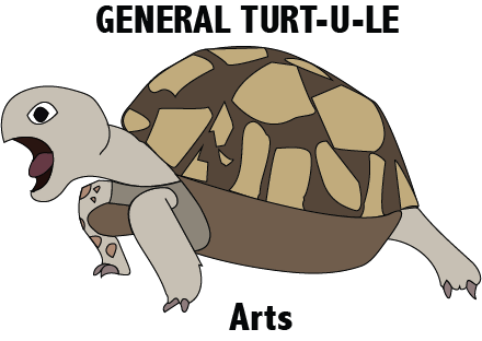
I choose a turtle because its my favourite animal. I like turtles because they have a hard outside but a soft inside just like me. I used a lot of circular and sharp edged shapes. The only typography that I added is my blog name.

 I chose to make the texture of the turtle smooth because if I made all the scales, it would look too cluttered.  I made the quality of the line finer then darker because it shows were the shape is completely. The letterform says 'GENERAL TURT-U-LE Arts' because its the name of my blog and what I call myself on social media.

 The name of the font I used is . All the lines are the same size, its a thin medium size. The shapes inside the turtle's shell, to me, they represent the shapes of provinces, territories, states etc. From this assignment I learned how to use the basic pen tool,  the text tool, the erase tool properly and how to do all that with only a mouse.

I'm quite happy with how my logo turned out because to me it looks like I thought it would. If I were given a bit more time to complete this assignment, i would have changed the way the shell is shaped, the front leg (it was supposed to have scales but they wouldn't show up) and the legs. During this assignment I learned to look at every little bit inside your logo, for designing a logo. Next I would like to design more things in Illustrator.


Thursday 16 October 2014

The Third-Class Carriage

The Third-Class Carriage
By: The year one CyberARTS 2014-2015

Today in CyberARTS we recreated Daumier's Third-Class Carriage using the medium charcoal. Our challenge was to take one of the thirty small pictures of the third-class carriage. To complete this assignment, we used two types of charcoal. The first type was willow, the lighter shades, and the second was compressed charcoal, the darker shades.

I think that this recreation of Daumier's Third-Class Carriage presents imitationalism because of its concern for accuracy to the original small pictures we were given. In my opinion it turned out very close to the original. The darkest dark's matched up very well. In the top left corner, the mans hat, matches up very well with each other. Just to the left of the middle is a lady caring for her child I think that is anouther point that matches up very well.

I think our recreation of The Third-Class Carriage was successful in showing formalism by, all the lines, textures and shapes. It shows unity between these three elements by all the lines and shapes producing a skin like look.

Our recreation of Daumier's Third-Class Carriage shows emotionalism by the mood, expressive feelings and how subjective it is. It sets the mood by how dark the dark's are, the expressions on the peoples faces are and how the subjects are postured. In our recreation, the darkest dark's are the darkest we could possibly go. In my opinion, we matched up the faces quite well to the original. The posture of the subjects are a large key to this particular mood because in the 18th century third class was the lowest class you could get. You would sit in the last few train cars where all the sut would end up.