


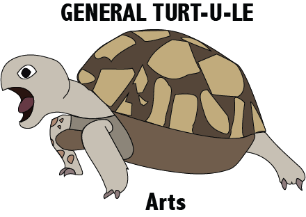
I chose to make the texture of the turtle smooth because if I made all the scales, it would look too cluttered. I made the quality of the line finer then darker because it shows were the shape is completely. The letterform says 'GENERAL TURT-U-LE Arts' because its the name of my blog and what I call myself on social media.
The name of the font I used is . All the lines are the same size, its a thin medium size. The shapes inside the turtle's shell, to me, they represent the shapes of provinces, territories, states etc. From this assignment I learned how to use the basic pen tool, the text tool, the erase tool properly and how to do all that with only a mouse.
I'm quite happy with how my logo turned out because to me it looks like I thought it would. If I were given a bit more time to complete this assignment, i would have changed the way the shell is shaped, the front leg (it was supposed to have scales but they wouldn't show up) and the legs. During this assignment I learned to look at every little bit inside your logo, for designing a logo. Next I would like to design more things in Illustrator.
No comments:
Post a Comment