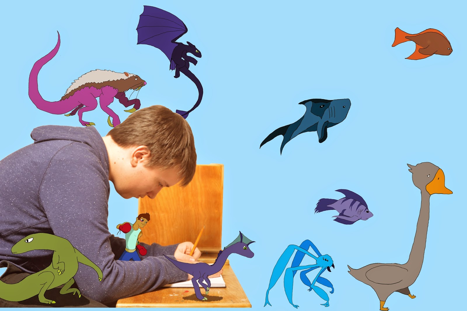
This piece is called "In My Head" which I did for my culminating project. The point of our culminating project was to choose something that mattered to us. I chose one of the biggest parts of my life, drawing. I chose drawing because I have drawn for the majority of my life. I wanted to show what it is like to be in my head whilst I draw. So I took a picture of my closest friend to portray myself and placed some of my quick drawings around him.
My intended message was that while I draw, many images go through my mind. I wanted to show some of the drawings that can, and will, come out of my mind and onto the page.
The photo I used is a picture of my friend looking focused towards the page of a sketchbook and drawing. I surrounded him with some of the artwork I drew for this assignment. I decided to put my drawings in these places because I needed to, somehow, show my drawings come to "life" and surrounding me.
My procedure was to start with my idea. I was lucky, since I had come up with it earlier. I started by sketching an idea in my sketchbook. It was a sketch of a person drawing with their sketches coming out of their head. After I came up with the idea, it was picture time. I chose to set up my picture inside of our classroom where we take portraits. My friend sat down and I asked him to look like he was drawing in my sketchbook. I took one vertical and one horizontal shot and felt that I had what I needed. Then I imported the photos that I took and chose the best one. I then brought my selected picture into Photoshop. The next step I did was I quick selected the photo of my friend and made a new layer and pasted it. Under that layer, I made a new layer and coloured it blue.
Next, I had to draw the original drawings outside of the computer. Once they were done, I scanned them into the computer. I then dragged the scanned drawings and placed them one by one into Photoshop. The next step was to trace the original images and colour them in. To do this I had to create a new file in Photoshop for each image and then add a layer for tracing and then a layer to colour it in. This took a few days as I was tracing multiple images. In the end I had 10 files to add to my original picture.
The last step to my process was to add the drawings to the photo. To do this I selected around each drawing and pasted it into the original picture file. I then moved them and sized them until I liked how it looked. For example, at first I placed the boxer behind my friends back but then I didn't like how it looked so I placed him between his arms so it looked like he was standing on the table. I then made a layer under the dinosaur and the lizard and lowered the opacity to 56% and drew smaller circles than the actual body and coloured them in black in order to create a shadow.
In the end, my surrealism picture has a total of 15 layers.
During this assignment I have learned a bit about myself. One thing I have learned is that the thoughts that I have while I draw and generally think are many. In the making of this project I took a lot of time to myself and just thought about more things. In my opinion I have connected more with myself and grown some self awareness of myself.
I am very happy with how my culminating project turned out. The topic I chose is, I believe, one, if not the only, more upbeat topics that has been chosen by the year one CyberARTS class for our culminating assignments. Although it was a long process I feel the outcome reflects what I was aiming for.
This is, I think, my last post for at least awhile. So, when I get back on, I'll post some improved artwork for all you peoples to see.
- GT
ARTS


